Risk Heat Map: How to Optimize Vulnerability Management


A risk heat map is a visual tool that helps to understand and communicate the risks within your company networks. It provides a snapshot of the levels of risk in different areas, making it easier to see where you need to pay more attention.
A typical heat map will have red zones that indicate high risk, yellow signifying moderate risk, and green marks that show areas of low risk. This color-coding is intuitive and helps you quickly grasp complex risk scenarios.
Benefits of using risk heat maps in network security monitoring?
Helps to identify vulnerabilities
The purpose of using a risk heat map is to identify, assess, and prioritize risks to better manage them. For instance, suppose you have several departments, and some are more vulnerable to security breaches.
A risk heat map will identify these vulnerable areas by marking them in red, prompting you to allocate more resources to strengthen them. It helps ensure you don't overlook critical risks that could have severe consequences for your network.
Guides planning
When expanding your network infrastructure, a risk heat map can highlight parts of the network that are already under strain. If your current servers are marked in yellow, showing moderate risk due to high usage, you know that adding more load could tip them into the red zone, signaling a high risk of failure.
Fosters more effective communication within the organization
With a heat map, it's easier for everyone, from top management to technical staff, to be on the same page when discussing the company's risk profile. This common understanding is crucial for making informed decisions and taking proactive measures to mitigate risks.
Makes risk management more transparent and actionable
A heat map enables you to spot potential problems early and devise strategies to address them, ensuring that your company networks remain robust and secure.
When using risk heat maps, the main advantage is seeing the big picture. You can easily share this visualization with teams across the company to make strategic decisions together.
For instance, if your IT department's network security shows a high risk in the red zone, everyone from management to the tech team knows it needs immediate attention. This shared understanding forces everyone to prioritize and act swiftly.
Promotes effective risk managing
With a heat map, you can continuously track your risk landscape and adjust your risk management processes accordingly. Let's say your finance department shows moderate risk in its data handling practices. You can focus on this area, implementing tighter controls and monitoring to mitigate potential threats.
Helps you gauge your company's risk appetite and tolerance
By visualizing risks, you are more aware of how much risk you are willing to accept in different areas. If your manufacturing operations department has a low tolerance for disruptions, any risk in that area will likely prompt immediate action to ensure smooth operations.
Ensures precision in risk assessment
With the detailed visualization, you can pinpoint which risks require immediate resources and which ones might only need monitoring. This way, you are not wasting efforts on low-priority issues. If your data storage systems are moving from yellow to red, for example, you can quickly allocate resources to expand capacity and prevent data loss.
Makes it easier to integrate risk management actions across the enterprise
The heat map serves as a guide for all teams to align their efforts towards reducing risks. If your telecommunication systems are at high risk, the teams responsible can collaborate more effectively, using the heat map as a common point of reference to implement security updates and protocols. This integration helps in maintaining a robust defense against potential threats, ensuring business continuity.
Key components of a risk heat map
Risk categories
These are the areas you need to examine, which could be specific departments like finance, IT, or HR. They could also be parts of your network infrastructure like servers, firewalls, or data storage systems. The idea is to break things down into segments so you can pinpoint exactly where the risks lie.
Risk levels or scores
These are usually represented by colors—red for high risk, yellow for moderate risk, and green for low risk. Each color corresponds to a risk level.
For example, if your IT department's cybersecurity is marked with red, you know it's likely a high-risk area needing immediate attention. The color coding is what makes the map intuitive. You can glance at it and instantly understand where the critical issues are without sifting through tons of data.
Impact and likelihood assessments
These tell you how severe a risk could be and how probable it is that it would happen. Picture your finance department facing a potential financial fraud issue. The impact might be high, but if your preventive measures are robust, the likelihood could be low. The heat map reflects this dual assessment to give you a balanced view.
Triggers or thresholds
These are the specific points at which a risk moves from one category to another. Let’s say server usage is at 70%, which you mark as a moderate risk in yellow. If it hits 90%, it might trigger a shift to high risk, moving it into the red zone. Knowing these thresholds helps you act before things get out of control.
Action plans or responses
These are linked to each risk level. They aren’t just a list of what could go wrong; they're a strategy for what you will do about it. If a department’s risk is in the red zone, you might decide to allocate more resources, implement new security measures, or even conduct regular audits. This proactive approach is vital to keeping everything under control.
Using these components together, the risk heat map becomes more than just a colorful chart. It's a dynamic tool that helps you see where you stand and what you need to do. The goal is to turn abstract concepts into concrete actions that protect your company networks.
Axes: Likelihood vs. impact
One of the most crucial elements of a heat map is the axes that quantify risk. The horizontal axis represents the likelihood, and the vertical axis indicates the impact. These two dimensions work together to give you a clear picture of where each risk stands.
Likelihood
Likelihood is about probability. How likely is it that a risk will happen? Say your IT team’s network is facing a potential cyber-attack. If you have had similar threats before and know your defenses aren't the strongest, the likelihood is high. This means the dot representing this risk is positioned further to the right on the map.
In contrast, if you are discussing a rare event like a natural disaster affecting your servers, the likelihood would be low, placing it towards the left side.
Impact
This is all about the severity if the risk does happen. Picture your finance department where the risk involves data breaches. The potential loss could be massive, impacting customer trust and financial stability. So, this risk scores high on the impact scale, placing it towards the top of the map.
On the other hand, if you are looking at a minor inconvenience like a brief email outage in HR, the impact is low, positioned lower on the vertical axis.
When these likelihood and impact axes intersect, each risk lands in a specific spot on the heat map. A cybersecurity threat with high likelihood and high impact will appear in the upper right quadrant, marked in red. It's screaming for immediate action.
Conversely, a low-likelihood, low-impact risk might sit in the lower left, colored in green, indicating it's not an urgent concern.
Therefore, using these axes helps you to prioritize. A risk like overloading your data storage might hover at a moderate likelihood but a substantial impact. You see it in the middle, in yellow, and realize you should act before it intensifies.
Understanding how likelihood and impact interact is the heartbeat of the risk heat map. This setup makes it intuitive to judge which risks can wait and which need swift attention.
Color coding: Low to high-risk areas
The colors of a heat map—red, yellow, and green—act like a universal language.
Red
Red is the universal sign for danger. On your heat map, it signals high-risk areas. Imagine our IT department's firewall, highlighted in red, indicating it’s a top priority for security improvements. Red is a call to action. It tells you that you need to focus resources and attention there immediately to avoid potential crises.
Yellow
Yellow stands for caution. It represents moderate risk levels. If your data storage systems are marked yellow, it suggests they're currently stable but nearing capacity. It's a phase of watchfulness. You know you need to monitor these systems closely, ensuring they don't drift into the red zone with additional strain or neglect.
Green
Green is the color of safety. It marks those areas where risks are low. Think about your HR department’s payroll system. If marked green on the heat map, it’s running smoothly with minimal risk factors detected.
Green zones provide peace of mind but don't mean you can ignore them completely. Continuous checks ensure they remain stable, adapting to any subtle changes that could elevate risks.
This intuitive color coding helps everyone—technical teams and management alike—read and understand the risk landscape at a glance. You can quickly identify which areas need immediate intervention, which ones need careful monitoring, and which are healthy and stable. This visual approach makes complex risk data accessible, enabling smarter, faster decision-making for managing company networks.
How to develop a risk heat map for your company network
Identify your critical systems and information assets
This might seem obvious, but getting it right sets the foundation for everything else. You need to dig into every corner of your organization to uncover potential threats. Think about it as a treasure hunt, but instead of gold, you are after the things that could go wrong.
For example, if you have a database storing customer financial data, that's something you would want to protect and, therefore, map. It’s crucial to prioritize these assets because they often carry high risks both in terms of security and operational impact.
Verify the reliability of your data sources
It’s crucial that the information feeding into your heat map is reliable. This means pulling data from trusted sources, whether internal monitoring systems or third-party vendors.
For example, if you are monitoring firewall logs, you need them to be complete and up-to-date to accurately reflect the network's security posture.
You must also use data to inform your assessments. It's vital to rely on historical data and current security reports to ensure your evaluations aren't just gut feelings.
For instance, if your servers have been under attack attempts before, it's a data-backed indication of high likelihood. Similarly, industry reports might show a trend in specific threats which could influence your assessments.
Consider your organization's risk appetite
How much risk are you willing to take for various departments? Let's say, your IT department is more risk-tolerant, focusing on performance over cautious protection. They might be more open to adopting new technologies quickly.
On the other hand, your finance department may have a low tolerance due to the sensitive nature of financial transactions, prompting stricter security measures.
Carefully define your impact categories
You must define what levels of impact are material to you —monetarily, reputationally, or otherwise. For instance, a data breach might have a severe monetary impact but only a moderate reputational one, depending on its nature and scope. Knowing this helps you tailor your heat map to emphasize different risk aspects based on business context.
When defining terms for your heat map, clarity is key. You want everyone to understand what each risk category signifies. For instance, a "high-risk" server might mean it's exposed to potential attacks due to outdated software, while a "moderate risk" might simply mean it's nearing capacity and needs monitoring. Clear definitions ensure your team isn't just staring at colorful charts but actually gaining valuable insights.
Lastly, you must communicate your findings effectively, translating your assessments into clear, understandable terms for everyone involved. This step is crucial in ensuring the heat map serves its purpose as a strategic tool.
Everyone, from management to tech teams, should be able to see why a particular risk is rated the way it is, fostering a unified approach to mitigating these risks.
By focusing on these aspects, your risk heat map becomes a living document, continuously evolving as your network and its threats shift. This dynamic tool offers a snapshot of your network’s health, enabling you to make informed decisions that align with your overall risk management strategy.
Designing the heat map
This is where you begin to visualize all your risk data in a way that's easy to understand and act upon. At this stage, you have already identified and assessed your risks.
Now, it's about putting that information into a format that everyone can grasp quickly. This is crucial because the heat map needs to communicate your risk landscape effectively to both technical teams and management.
Step 1. Choose your risk categories
These are the specific areas or departments you want your heat map to represent, such as IT security, data storage, or finance. Let's say you have concerns about your data storage infrastructure.
This could be one of the categories on your map, highlighting how overloaded systems pose a significant risk. By segmenting your map into clear categories, you make i easier to pinpoint where problems lie.
Step 2. Assign colors to represent different risk levels
Red is for high risk, yellow for moderate, and green for low. Think of your IT security department. If it's marked in red, everyone knows it's high risk and needs immediate attention. This intuitive color-coding lets you see at a glance where your focus should be without needing to delve into detailed reports.
As we design the map, you also need to consider the placement of each risk based on likelihood and impact, which you assessed earlier. Imagine a cyberattack risk for your finance department. It might be placed high on the vertical axis for impact and far to the right for likelihood. This places it squarely in the red zone, signaling a need for urgent action.
The placement needs to be precise. For instance, if your HR department's payroll system is experiencing some minor technical glitches, this would likely sit lower on the map, perhaps in the green zone, meaning it's not a current priority. But if the same system starts showing signs of a data breach, its position might shift closer to the red zone, raising its priority.
Step 3. Set your triggers or thresholds
These are the points at which a risk level changes. For example, if your server usage hits 90%, a predefined threshold might shift it from yellow to red, alerting you to an elevated risk level. Knowing these thresholds helps you act before issues escalate.
By carefully designing the heat map with these elements, you turn complex assessments into an accessible tool. It becomes a clear visual representation of your company’s risk profile, guiding your decision-making process on where to focus resources and efforts.
Implementing the risk heat map
Implementing the risk heat map involves more than just creating a colorful chart. It’s about integrating this tool into your daily operations to make it truly valuable for your organization.
Ensure the map is accessible to everyone who needs it
This might mean embedding it into your existing dashboard systems, so department heads can easily pull it up during meetings. Your IT team, for instance, might incorporate the map into their regular status reports, providing them a visual cue to prioritize security patches for areas in the red zone.
Establish a routine for updating the map
Risks change over time, some get resolved, and new ones emerge. Imagine your data storage capacity risk. If you expand your storage, what was once a yellow zone might now turn green.
Regularly scheduled reviews ensure the heat map remains accurate and relevant. This might involve monthly check-ins, where each department updates its section of the map with the latest data points.
Ensure everyone can read the heat map
Training is a crucial component. Everyone must know how to read and interpret the map effectively. You could conduct workshops where team members across departments learn to use the heat map to identify and address risks.
For example, your HR department might learn to spot emerging compliance risks before they escalate. These sessions turn the heat map from a simple visualization into a powerful decision-making tool.
Align your action plans with what the map reveals
If your finance department is consistently in the red zone for security risks, this signals the need for immediate intervention, such as implementing new encryption standards or hiring additional security experts. The heat map guides you in deploying resources where they are most needed, avoiding a scattergun approach to risk management.
Ensure the heat map fosters open communication and collaboration
The risk map should form a centerpiece for discussions about risk during cross-departmental meetings. With everyone looking at the same data, you can have more productive conversations about mitigation strategies.
For instance, if your customer service department sees a potential risk in handling sensitive customer data, they can work closely with the IT team to implement stricter data access controls.
The implementation phase is about turning the risk heat map into a living document that actively contributes to your risk management strategy. It helps you stay agile, informed, and ready to tackle any challenges that come your way.
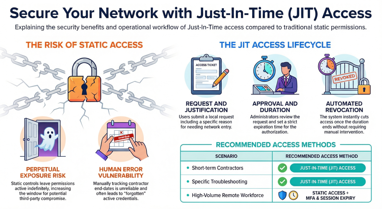
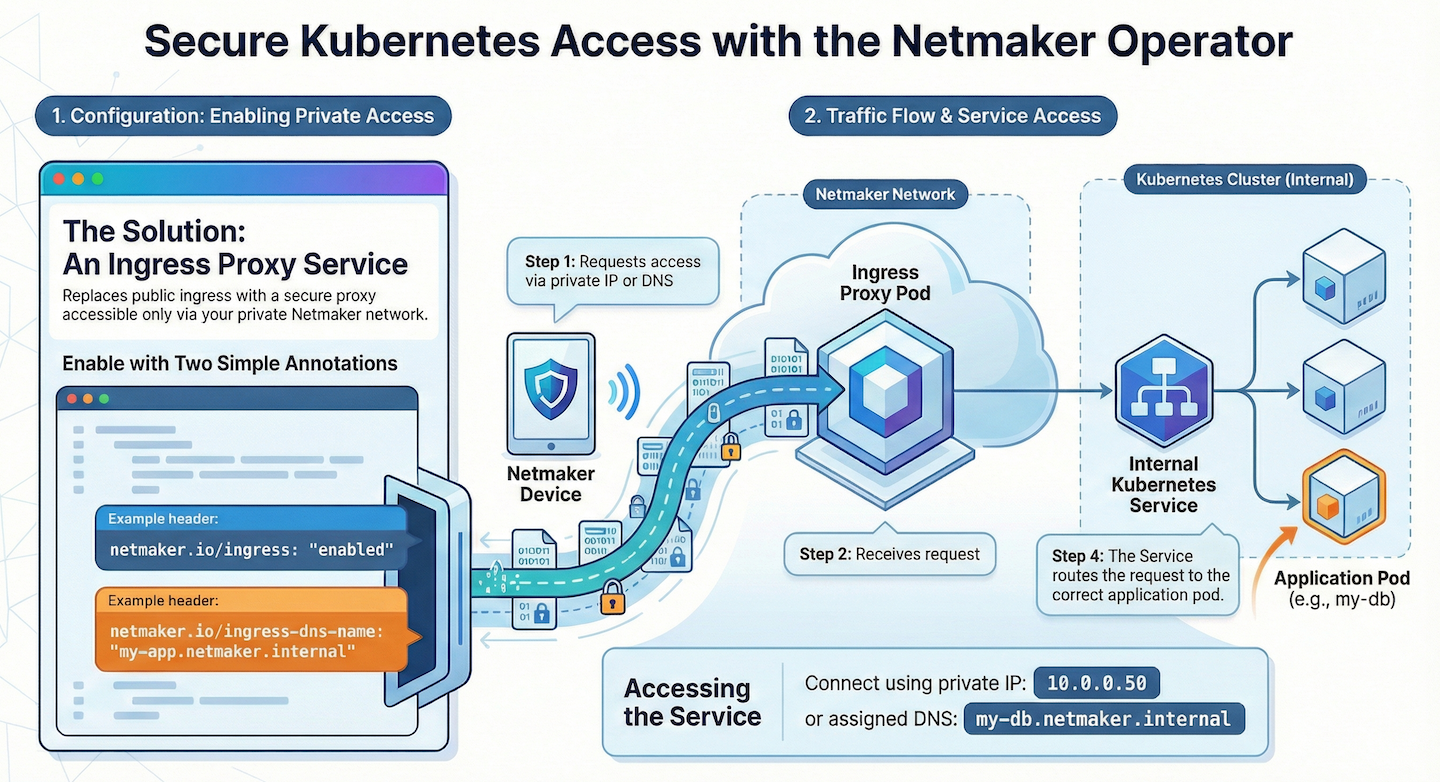
Enhancing Risk Management with Netmaker
Netmaker offers robust solutions that significantly enhance network security and risk management efforts. By enabling seamless and secure connectivity across distributed networks, Netmaker reduces the red zones on your risk heat map. Its ability to run on a single server or in a containerized environment using Docker or Kubernetes, ensures that your network infrastructure remains scalable and resilient. With features like automated VPN creation and management, Netmaker facilitates secure communication between your departments, mitigating high-risk scenarios and reducing vulnerabilities across the board.
Additionally, Netmaker's advanced server installation capabilities allow for efficient network operations and firewall management, crucial for maintaining a secure network environment. By integrating Netmaker, organizations can effectively balance the workload on their servers, addressing moderate risks highlighted in the yellow zones of the risk heat map. This ensures that network expansion plans are informed and strategic, preventing potential strain that could escalate risk levels. To get started with enhancing your network security using Netmaker, sign up here.


.svg)